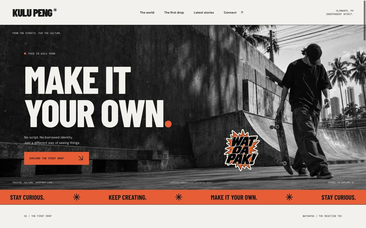
An editorial website for KULU PENG, bringing the creator’s personality, featured content and social channels into a dedicated online home.
Merchandise is presented as a design concept, not a completed online checkout.
The brief
Social content is spread across platforms and moves quickly. A dedicated site needs to introduce the person behind it and make the next place to watch or follow obvious.
Explore the complete design.
Move through the design, from the first impression to the final detail. Drag the page control or scroll inside a preview.
Design decisions
Let the creator’s voice set the direction.
The page uses a strong visual identity and selected content to establish a recognisable home for the creator. Social pathways stay easy to find, with a merchandise design concept presented as an extension of the identity.
- A recognisable creator-led identity.
- Selected content with direct social pathways.
- A merchandise concept connected to the brand.
Across devices
Made for an audience arriving from social.
The mobile experience keeps the introduction, content and follow links within a straightforward browsing journey.
The thinking behind the work
Give a creator’s audience a place to understand the whole identity.
A social feed is built around individual posts. KULU PENG’s website brings the introduction, selected content and social pathways into a single branded destination. Its business role is to make the creator recognisable beyond one piece of content and give interested visitors somewhere purposeful to go.
Brand recognition
Let the personality carry the presentation.
The site uses a strong visual identity and an editorial introduction to establish the creator’s voice. Selected content sits within that setting instead of appearing as an unrelated collection of links. The design gives the audience a way to understand the person and identity behind the material they may already have seen elsewhere.
This approach is intended to strengthen recognition. A visitor arriving from a social platform should be able to connect the website with the creator they came to find. For future commercial conversations, a coherent presentation also gives potential collaborators a more complete introduction than a single post can provide.
Audience journeys
Make following the work straightforward.
Direct social pathways remain easy to find alongside the selected content. This respects the way the audience already engages with the creator: the website does not need to contain every video or replace each social channel. It needs to explain the identity and provide clear routes to continue watching or following.
The mobile sequence keeps the introduction, content and follow links close to that task. The intended benefit is continuity between an initial visit and further engagement. Rather than relying on visitors to search again for the right account, the site gives that next action a visible place in the experience.
Commercial direction
Show how the identity could extend into products.
The merchandise section presents a design concept connected to the creator’s identity. It gives the brand a way to communicate a possible product direction through a recognisable visual language. The concept is part of the presentation, rather than evidence of a completed online store.
For potential collaborators, this makes a future commercial direction easier to discuss. A recognisable product expression gives the conversation something concrete to build on: how the creator’s character could translate into an item their audience would recognise and want to own.
The experience in practice
From a social introduction to a fuller picture
Recognise the creator
Encounter the identity and introduction in a dedicated setting beyond the social feed.
Explore the work
Browse selected content and the visual direction, including the merchandise concept.
Continue following
Use the direct social pathways to keep watching and engaging on the relevant channels.